
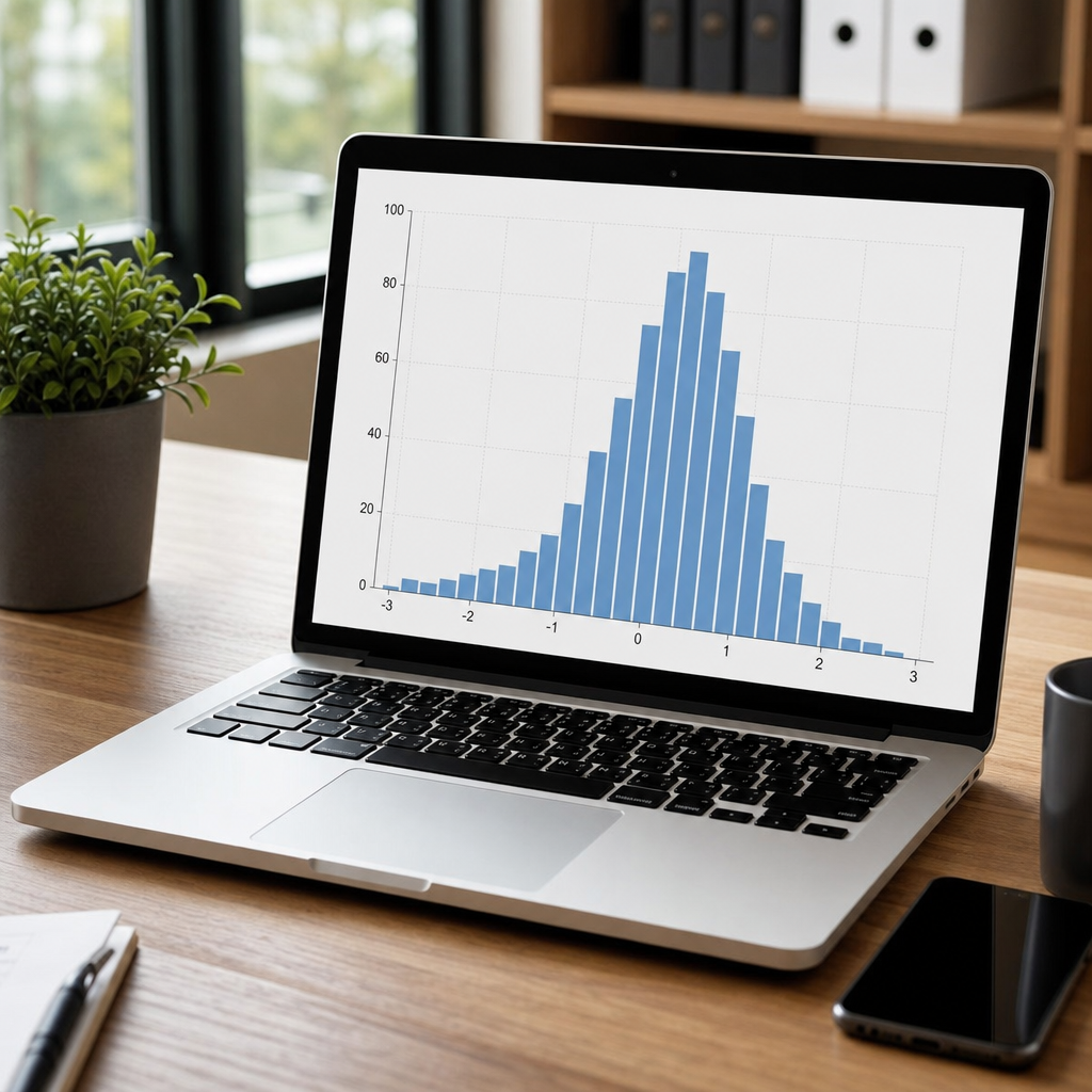
Displaying distributions with histograms is one of the fastest, most reliable ways to understand what a dataset is really saying before you calculate a single advanced metric. In data visualization, a histogram groups numeric values into consecutive intervals called bins and then shows how many observations fall inside each interval. That simple structure reveals shape, center, spread, gaps, clusters, and unusual values in a way raw tables never can. I use histograms at the start of almost every analysis because they expose whether data are roughly symmetric, strongly skewed, multimodal, truncated, or contaminated by errors. Those patterns directly influence later choices such as summary statistics, modeling assumptions, transformation methods, and dashboard design.
As a hub topic within data analysis and interpretation, data visualization covers the full set of techniques used to turn numbers into patterns people can inspect. Histograms sit near the foundation because many other charts answer different questions. A bar chart compares categories. A line chart tracks change over time. A scatterplot studies relationships between two variables. A histogram answers a distinct question: how are values distributed? That distinction matters. Confusing a histogram with a bar chart leads to poor binning, misleading spacing, and wrong conclusions about continuity. When the variable is quantitative and the goal is to understand frequency across a range, the histogram is usually the right first choice.
Why does this matter in practical work? Because distribution shape affects business, science, operations, and policy decisions. Website session durations are usually right-skewed, so using the mean alone can overstate a typical visit. Manufacturing tolerances may show a second peak, hinting at two machines behaving differently. Patient wait times can cluster and stretch, which changes staffing plans. Exam scores may pile up near the upper limit, signaling a ceiling effect. Histograms make these realities visible in seconds. They also help catch data quality problems such as impossible negative values, suspicious rounding, or units mixed in the same field. Good analysis begins with seeing the distribution clearly.
This article serves as a comprehensive hub for data visualization through the lens of histograms. It explains when to use them, how to choose bins, what patterns mean, how to compare groups, and where histograms fit alongside box plots, density plots, violin plots, and dashboards. If you are building a broader data analysis workflow, think of this page as the bridge between descriptive statistics and more specialized visual methods. A strong histogram does not merely decorate a report; it supports interpretation, sharper questions, and better decisions.
What a histogram shows and how to read one
A histogram displays the distribution of a single quantitative variable by dividing its range into bins and plotting frequency, count, or density on the vertical axis. Adjacent bars touch because the intervals are continuous. To read one well, start with five features: center, spread, skewness, modality, and outliers. Center tells you where values tend to fall. Spread shows variability. Skewness indicates whether the tail extends farther left or right. Modality tells you whether there is one peak or several. Outliers are values unusually distant from the rest. In practice, I scan in that order because it quickly tells me which summaries and tests may or may not be appropriate.
Consider employee commute times. A histogram might show most workers between 15 and 35 minutes, a long right tail beyond 60 minutes, and a tiny cluster around 90 minutes. That suggests a median may describe the typical experience better than the mean, and the distant cluster may represent a satellite office or public transit users. In ecommerce, order values often show many low purchases and a long tail of large baskets. In laboratory measurement data, a narrow, symmetric histogram may signal stable instrumentation, while a broad one may indicate process drift or mixed populations. The visual is simple, but the interpretation is operational.
Axes also matter. Count is the default and easiest to explain. Relative frequency converts counts into proportions, which helps when comparing groups of different sizes. Density scales the bars so total area equals one, making the histogram compatible with probability density overlays. Analysts sometimes miss that changing the scale changes the story people perceive. If executives are comparing regions with unequal transaction volume, a density histogram may be fairer than a count histogram. Clear axis labels and bin widths prevent confusion.
When to use histograms in data visualization
Use a histogram when you have one numeric variable and want to inspect its distribution before summarizing, segmenting, or modeling it. This is especially important in exploratory data analysis, quality control, forecasting preparation, experiment review, survey analysis, and feature engineering for machine learning. Before fitting a linear model, I check histograms of predictors and residual candidates because severe skew, zero inflation, or clipping may require transformation or a different model family. Before setting a service-level target, I inspect the histogram of response times because averages hide tails that customers actually experience.
Histograms are not ideal for every situation. If the variable is categorical, use a bar chart. If sample size is tiny, a dot plot or strip plot often communicates individual observations better. If the goal is comparing two numeric variables together, use a scatterplot or hexbin chart. If you need a compact summary for multiple groups, box plots can save space. Still, for discovering shape, a histogram remains the workhorse. It answers questions stakeholders ask all the time: Are most values concentrated in one range? Is the data normal enough for this method? Are there multiple subgroups? Is there evidence of truncation or an upper limit?
In business reporting, histograms often belong upstream of dashboards rather than on the final executive page. Teams may prefer simplified KPIs later, but the analysis behind those KPIs should start with distribution views. In that sense, histograms are both an analytic chart and a governance chart. They validate assumptions before someone publishes a single metric.
Choosing bin width without distorting the story
Bin choice is the most important design decision in a histogram because it can reveal or conceal structure. Too few bins oversmooth the data and hide clusters. Too many bins create a noisy picket fence that exaggerates randomness. Good practice starts with fixed-width bins and then tests sensitivity by trying several reasonable alternatives. Established rules help. Sturges’ formula is simple but tends to underspecify bins for large datasets. The square-root rule is quick and coarse. Scott’s rule uses standard deviation and works well for near-normal data. The Freedman-Diaconis rule uses the interquartile range and is more robust to outliers, which is why I use it frequently for messy operational data.
The right answer also depends on context. In retail pricing, bin edges aligned to real price thresholds such as $0 to $10, $10 to $20, and so on may be more interpretable than mathematically optimal widths. In manufacturing, bins should respect engineering tolerance boundaries. In healthcare, age histograms may use five-year intervals because clinicians already think that way. The principle is consistency plus interpretability. If you compare groups, keep the same bin edges across groups. Otherwise differences may be visual artifacts rather than true differences.
| Bin method | Best use | Main strength | Main limitation |
|---|---|---|---|
| Sturges | Small to moderate samples | Simple, widely available | Too few bins for large data |
| Square-root | Quick first pass | Easy mental estimate | Ignores spread and outliers |
| Scott | Roughly normal data | Balances smoothness mathematically | Sensitive to extreme values |
| Freedman-Diaconis | Skewed or messy data | Robust because it uses IQR | Can produce many bins in huge samples |
| Domain-defined bins | Operational reporting | Matches real thresholds | May hide fine structure |
Whatever method you choose, document it. In Tableau, Power BI, Excel, Python, or R, defaults vary. A chart that looks clean in one tool may look materially different in another because the software selected different bins. Reproducibility matters as much in visualization as in modeling.
Patterns histograms reveal in real analysis
A well-made histogram exposes diagnostic patterns that change interpretation immediately. Right skew is common in income, claims cost, order value, and response time data. Left skew appears in easy test scores or capped satisfaction ratings. A bimodal histogram often signals mixed populations, such as two customer segments or two production lines. Uniform-looking distributions may occur in randomized test assignments or synthetic placeholders. A pile-up at zero can indicate zero-inflated behavior, common in defect counts or monthly purchase frequency. Sharp cutoffs can reveal censoring, business rules, or sensor limits.
One example from operations analysis stands out. A support center reported an acceptable average resolution time, but the histogram showed two peaks: one cluster under two hours and another near two days. The average blended urgent chat tickets with escalated technical cases, hiding a process split. Once the team separated ticket types, staffing and routing improved. Another common example appears in payroll data. A histogram of overtime hours may show spikes at exact integers like 5, 10, and 15, suggesting manual entry or rounding behavior. That is not merely a visual curiosity; it points to process bias that can affect labor forecasting.
These patterns also guide statistical decisions. Strong skew may favor medians, percentiles, or log transformation. Heavy tails may require robust estimators. Multiple peaks may justify segmentation before modeling. A histogram cannot prove causation, but it often tells you which questions to ask next and which assumptions deserve skepticism.
Comparing groups and combining histograms with other charts
Single histograms are powerful, but analysis often requires comparison. You can compare groups with small multiples, transparent overlays, or faceting by region, cohort, product line, or time period. Small multiples are usually the safest because overlays become cluttered fast, especially when sample sizes differ. Keeping common axes across panels is essential. Without consistent scales, viewers overread minor differences. In churn analysis, for example, histograms of tenure for active versus canceled customers may show that churn is concentrated in the first three months. In quality analytics, separate histograms by machine shift can reveal whether night production has wider variation.
Histograms also work best when paired with complementary visuals. A box plot adds median, quartiles, and possible outliers in compact form. A density plot smooths the distribution, useful for presentations after the exploratory phase. A violin plot combines density and summary shape for group comparisons. A scatterplot can then investigate why the distribution looks the way it does by relating the variable to another factor. In a complete data visualization workflow, the histogram is often the opening move, not the only move.
For dashboards, resist the temptation to replace histograms with gauges or single-number tiles. Distribution-aware reporting is more honest. If a KPI measures customer delivery time, showing the full spread alongside median and 95th percentile gives leaders a truer picture than reporting average delivery time alone. That is how visualization supports interpretation rather than decoration.
Common mistakes, tools, and best practices
The most common histogram mistakes are avoidable. First, using unequal bin widths without normalization distorts frequency. Second, comparing groups with different bin definitions creates fake differences. Third, truncating the x-axis can hide tails or outliers. Fourth, calling a bar chart a histogram confuses discrete categories with continuous ranges. Fifth, adding too many colors, gradients, or 3D effects weakens readability. Clean design wins: clear title, labeled axes, sensible bins, and brief annotations where necessary.
Modern tools make histogram creation easy, but defaults deserve scrutiny. In Excel, the Analysis ToolPak and newer chart options can build histograms quickly, yet the automatic bins often need adjustment. In Python, matplotlib, seaborn, and plotly offer strong control over bins, density, and faceting. In R, ggplot2 supports layered workflows and transparent comparisons. In Tableau and Power BI, calculated bins and dashboard filters help teams explore subgroups interactively. Whatever stack you use, validate the chart against summary statistics such as median, interquartile range, minimum, maximum, and key percentiles. Visual inspection and numeric summary should reinforce each other, not conflict unexpectedly.
Accessibility matters too. Use sufficient contrast, avoid relying on color alone, and write captions that state the main takeaway in plain language. If the audience is mixed, define terms like skew and percentile the first time they appear. Good data visualization respects both analytic rigor and human comprehension.
Histograms remain essential because they show the full distribution behind any numeric measure, and that view improves every later step in data analysis and interpretation. They help you see whether values cluster tightly or spread widely, whether a mean is representative or misleading, and whether strange patterns signal outliers, mixed populations, or data quality issues. In practical work, that translates into better forecasting, more honest reporting, stronger model selection, and faster problem diagnosis. Few charts deliver so much insight with so little visual complexity.
As a hub for data visualization, this article has framed where histograms fit and why they deserve a permanent place in your workflow. They are not substitutes for box plots, scatterplots, density plots, or dashboards; they are the starting point that makes those later visuals smarter. When you choose sensible bins, keep scales consistent, and interpret shape carefully, a histogram becomes a decision tool rather than a textbook graphic. It helps analysts ask sharper questions, managers spot operational issues, and teams challenge assumptions before they harden into bad policy.
If you want stronger analysis, start by reviewing the distribution of every important numeric variable with a histogram. Then link that insight to the next visualization or statistical method your question requires. Build that habit, and your entire data visualization practice becomes more accurate, more explainable, and more useful.
Frequently Asked Questions
What is a histogram, and how is it different from a bar chart?
A histogram is a chart used to display the distribution of numeric data by grouping values into continuous intervals called bins. Each bar represents a range of values, and the height of the bar shows how many observations fall within that range. This makes histograms especially useful for understanding how data is spread out, where it tends to cluster, and whether there are any gaps, extreme values, or unusual patterns in the dataset.
The main difference between a histogram and a bar chart is the type of data each one is designed to show. A histogram is built for quantitative, continuous, or discrete numeric data that has a natural order. Its bars touch because the intervals are connected parts of the same scale. A bar chart, by contrast, is used for categorical data such as product types, regions, or survey responses. In a bar chart, the categories are separate from one another, so the bars are usually spaced apart.
That distinction matters because histograms help you answer questions about distribution, not just totals. With a histogram, you can quickly see whether data is symmetric or skewed, tightly concentrated or widely spread, and whether one or more peaks appear in the data. In practice, that makes histograms one of the most valuable first-step tools in data visualization and exploratory analysis.
Why are histograms so useful when analyzing a dataset?
Histograms are useful because they turn a long list of numbers into a visual summary that is easy to interpret. Before calculating averages, standard deviations, or more advanced statistics, a histogram lets you see what the data is actually doing. You can identify the general shape of the distribution, estimate the center, judge the spread, detect possible outliers, and notice if there are multiple clusters or subgroups hidden in the values.
This matters because summary statistics alone can be misleading. Two datasets can have the same mean and similar variance while having very different shapes. One may be roughly bell-shaped, another may be strongly right-skewed, and another may contain two distinct peaks. A histogram reveals those differences immediately. That visual context helps you decide which statistical methods are appropriate and whether the data may need transformation, segmentation, or closer inspection.
Histograms are also valuable for quality control, business reporting, scientific measurement, and operational analysis. For example, they can show whether customer purchase amounts concentrate in a narrow range, whether manufacturing measurements stay within tolerance, or whether response times include a long tail of slow cases. Because they are fast to build and easy to read, histograms often provide the clearest first look at the real structure of a dataset.
How do bin sizes affect the way a histogram looks?
Bin size has a major effect on a histogram because it controls how values are grouped. If the bins are too wide, important detail can disappear. A distribution that actually contains multiple clusters or subtle gaps may look overly smooth and simple. On the other hand, if the bins are too narrow, the histogram can become noisy and fragmented, making random variation look more meaningful than it really is.
The goal is to choose a bin width that reveals the overall structure without exaggerating minor fluctuations. A good histogram should make patterns easier to see, not harder. When binning is chosen well, you can more confidently identify skewness, modality, spread, and unusual observations. When it is chosen poorly, the same data can look completely different, which is why analysts often test several bin settings before settling on one.
There is no single perfect rule for every dataset, but practical judgment helps. Larger datasets can usually support more bins because they contain enough observations to fill them meaningfully. Smaller datasets often need fewer, wider bins to avoid a sparse, jagged display. Many software tools offer automatic binning methods, which can be a solid starting point, but it is still important to review the output critically. If changing the bins dramatically changes the story, that is a sign to interpret the chart carefully and consider showing multiple views.
What patterns should you look for when reading a histogram?
When reading a histogram, start with the overall shape. Ask whether the data looks roughly symmetric, skewed to the left, skewed to the right, uniform, or concentrated around one or more peaks. This gives you an immediate sense of how observations are distributed and whether a simple average is likely to represent the data well. A strongly skewed histogram, for example, often suggests that the mean may be pulled away from where most observations actually lie.
Next, look at the center and spread. The center tells you where the data tends to cluster, while the spread shows how much variation exists. A narrow histogram suggests consistency, while a wide one indicates greater variability. Then watch for gaps, isolated bars, or long tails. Gaps can suggest separate groups, while isolated values may indicate outliers, unusual events, or potential data quality issues. Long tails often signal rare but important high or low values that deserve attention.
It is also important to look for modality, meaning the number of prominent peaks. A single peak may suggest one dominant process, while two or more peaks can indicate that the data combines different populations or behaviors. For example, a histogram of delivery times might show one cluster for local shipments and another for long-distance ones. Recognizing these patterns can change the direction of your analysis entirely, because it tells you whether you are looking at one unified distribution or a mixture of different underlying processes.
When should you use a histogram instead of another type of chart?
You should use a histogram when your main goal is to understand the distribution of a numeric variable. It is the right choice when you want to see how values are grouped, whether the data is concentrated or dispersed, and whether there are patterns such as skewness, clusters, or outliers. Histograms are especially effective early in analysis, when you are still learning the shape and behavior of the data before deciding on statistical models or business conclusions.
A histogram is usually better than a table of raw numbers because it makes frequency patterns visible at a glance. It is often better than a simple summary statistic because it shows structure instead of compressing everything into a single number. Compared with a line chart, which emphasizes change over time, a histogram focuses on how often values occur. Compared with a box plot, which is excellent for compact summaries, a histogram gives more detail about the actual shape of the distribution.
That said, the best chart depends on the question you are asking. If you need to compare categories, a bar chart may be more appropriate. If you want to examine relationships between two numeric variables, a scatter plot is usually better. If you want a compact comparison of distributions across groups, a box plot or violin plot may help. But when the question is, “What does the distribution of this numeric data really look like?” a histogram is one of the fastest and most reliable answers.





