
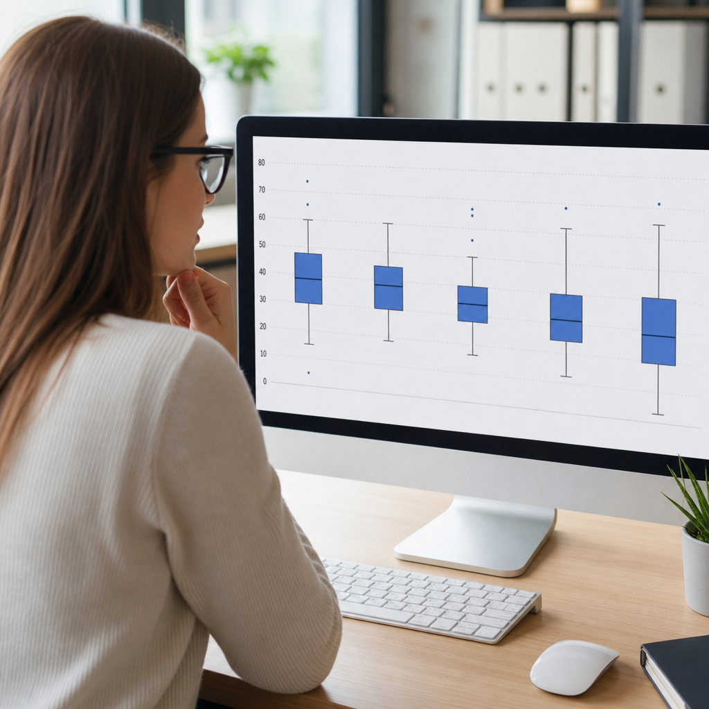
Box plots are one of the fastest ways to understand a dataset because they condense center, spread, and unusual values into a compact graphic. In data visualization, a box plot summarizes a distribution using the median, quartiles, whiskers, and potential outliers. For beginners, that sounds technical, but the idea is simple: instead of listing every number, the chart shows where most values sit, how widely they vary, and whether a few points behave very differently from the rest. I have used box plots in business reporting, quality control reviews, survey analysis, and experiment readouts because they reveal structure that averages alone often hide.
Within the broader field of data analysis and interpretation, data visualization turns raw numbers into patterns people can understand and act on. A line chart shows change over time. A bar chart compares categories. A histogram shows frequency across bins. A scatter plot reveals relationships between two variables. A box plot answers a different question: what does the distribution of a numeric variable look like, especially when you need to compare several groups at once? If you are reviewing customer wait times across stores, exam scores across classes, or defect rates across production lines, a box plot gives a quick and disciplined summary.
The chart is built around the five-number summary: minimum, first quartile, median, third quartile, and maximum, though practical box plots often define whiskers using a rule rather than the absolute min and max. The median is the middle value. Quartiles divide ordered data into four parts. The box spans from the first quartile to the third quartile, which captures the middle 50 percent of observations. The line inside the box marks the median. Whiskers extend outward to show the non-outlier range. Points beyond that range are plotted individually as outliers.
Why does this matter? Because many real datasets are messy. They may be skewed, contain extreme values, or have very different spreads across groups. Averages can be pulled upward by a few unusually high numbers, making a situation look better or worse than it really is. Box plots counter that problem by emphasizing the median and interquartile range. They also scale well when you need to compare many categories side by side, which is why they appear so often in statistical software, dashboards, and scientific papers.
This article serves as a hub for understanding data visualization through the lens of box plots. Along the way, it also connects the chart to larger visualization decisions: when to use it, when not to use it, how to read it correctly, and how it compares with histograms, violin plots, dot plots, and bar charts. If you are starting in analytics, learning box plots will sharpen both your statistical thinking and your chart selection skills.
What a box plot shows and how to read one
A box plot displays distribution, not individual sequence. To read one, start with the line inside the box. That is the median, which is the 50th percentile. If the median is centered within the box, the middle half of the data may be fairly balanced. If it sits closer to the bottom or top edge, the distribution may be skewed. Next, look at the bottom and top of the box. These are the first quartile and third quartile, often written as Q1 and Q3. The distance between them is the interquartile range, or IQR, one of the most useful measures of spread because it focuses on the middle half of the data.
Then read the whiskers. In the most common version, whiskers extend to the smallest and largest values within 1.5 times the IQR below Q1 and above Q3. Values beyond those cutoffs are shown as separate points. This convention comes from John Tukey, whose exploratory data analysis work made the box plot a standard tool. The 1.5 × IQR rule does not mean those points are errors. It means they are unusually far from the center relative to the rest of the dataset and deserve attention.
Imagine monthly delivery times for two warehouses. Warehouse A has a median of 2.1 days and a narrow box from 1.9 to 2.4 days. Warehouse B has a similar median, 2.2 days, but a much wider box from 1.6 to 3.1 days, with several points above 5 days. Even though average performance might look close, the box plots tell a more operationally useful story: Warehouse A is stable, while Warehouse B is inconsistent and produces occasional serious delays.
One important caution: a box plot reduces detail. Two distributions can have similar quartiles but different shapes. For example, one group may be bimodal, with values clustered around two separate peaks, while another may be smoothly spread. Their box plots can look nearly identical. That is why analysts often pair box plots with strip plots, histograms, or sample-size labels when precision matters.
How box plots are constructed from raw data
Building a box plot begins by sorting the values from low to high. Once the data are ordered, the median is identified. For an odd number of observations, the median is the center value. For an even number, it is usually the mean of the two middle values. Q1 is the median of the lower half of the data, and Q3 is the median of the upper half. Software packages differ slightly in quartile calculation methods, especially for small samples, so values may vary across Excel, R, Python, Minitab, and SPSS. In professional work, I always check the software definition before comparing outputs from different tools.
After calculating Q1 and Q3, subtract Q1 from Q3 to get the IQR. Then compute the lower fence as Q1 minus 1.5 × IQR and the upper fence as Q3 plus 1.5 × IQR. The whiskers reach to the most extreme observed values still inside those fences. Any observation outside them is plotted individually. Some box plots also mark the mean with a symbol, notch the box to show an approximate confidence interval for the median, or vary width according to sample size, though the standard beginner version uses equal widths.
Consider the ordered dataset 4, 5, 6, 7, 7, 8, 9, 10, 14. The median is 7. Q1 for the lower half 4, 5, 6, 7 is 5.5, and Q3 for the upper half 8, 9, 10, 14 is 9.5. The IQR is 4. The lower fence is -0.5 and the upper fence is 15.5, so there are no outliers by the standard rule. Now replace 14 with 22. Q3 becomes 9.5, the IQR stays 4, and the upper fence remains 15.5. The value 22 becomes an outlier, shown as a separate point. That single change immediately signals an unusual observation.
| Element | Definition | What it tells you |
|---|---|---|
| Median | Middle value of ordered data | Typical center, less affected by extremes than the mean |
| Q1 | 25th percentile | Lower boundary of the middle 50 percent |
| Q3 | 75th percentile | Upper boundary of the middle 50 percent |
| IQR | Q3 minus Q1 | Spread of the middle half of the data |
| Whiskers | Most extreme non-outlier values | Overall range excluding flagged outliers |
| Outliers | Points beyond 1.5 × IQR from quartiles | Unusual values that may need investigation |
When to use a box plot in data visualization
A box plot is best when you need to compare distributions across categories quickly. If a retailer wants to compare basket values across regions, a box plot can show whether one region has a higher typical purchase size, wider variability, or more extreme big-ticket transactions. In healthcare, analysts use box plots to compare patient wait times across clinics. In education, they compare exam scores by course section. In manufacturing, they compare machine output dimensions to spot instability or process drift. The chart works especially well when there are at least several dozen observations per group, because quartiles become more stable and meaningful.
Box plots are also useful early in analysis. Before fitting models or running significance tests, I often inspect box plots to understand whether groups differ in center or spread and whether outliers might distort conclusions. This step can prevent mistakes, such as assuming equal variance across groups when one category is much more volatile than another. In quality management and Six Sigma settings, box plots often complement control charts by summarizing batches, shifts, or suppliers.
Another advantage is space efficiency. A dashboard might need to compare ten product lines on return rates. Ten histograms would consume too much space and be harder to scan. Ten box plots stacked vertically can communicate the main differences in a few seconds. Because the chart is compact, it is common in reports where decision-makers need a fast comparison without reading a technical appendix.
That said, box plots are not ideal for every audience or every dataset. For very small samples, quartiles may be unstable and the chart may imply more certainty than the data support. For highly discrete data, such as counts from 0 to 5, a dot plot or bar chart can be clearer. For communicating distribution shape to nontechnical audiences, histograms or violin plots may be more intuitive because they show where values concentrate directly.
How box plots compare with other common charts
Choosing the right chart is a core skill in data visualization. Box plots summarize distribution better than bar charts, which often hide variation behind a single average. If you compare employee response times by team using only mean bars, one team with a few severe delays may look similar to a consistently fast team. A box plot reveals that difference immediately. This is one reason many analysts discourage bar charts for continuous data unless the goal is strictly showing a summary statistic.
Compared with histograms, box plots are more compact and easier to compare across many groups, but they show less shape detail. A histogram can reveal bimodality, gaps, and heavy tails. A box plot cannot show those patterns directly. Violin plots address that limitation by combining a box-plot-like summary with a mirrored density shape. They are powerful, but beginners often find them harder to read at first. Strip plots and swarm plots show every point, which improves transparency, though they can become cluttered with large samples.
Scatter plots answer a different question altogether: the relationship between two numerical variables. If you want to see whether ad spend rises with revenue, use a scatter plot. If you want to compare the distribution of revenue across campaign types, use a box plot. Line charts are for trends over ordered time. Pie charts are limited and often poor for precise comparison. Heatmaps are useful for matrices or intensity patterns. The broader lesson is that no chart is universally best. A box plot is specialized, and its strength lies in comparing numeric distributions by category.
In practice, strong analysis often combines visuals. For instance, a product analytics team might use a line chart to show weekly retention, a scatter plot to examine session length versus conversion, and box plots to compare order values across acquisition channels. Thinking in terms of the question first, then the chart, leads to better interpretation and better decisions.
Common mistakes beginners make and how to avoid them
The most common mistake is treating every point beyond the whiskers as an error. Outliers can be data-entry mistakes, but they can also be the most important observations in the dataset. A hospital billing outlier could represent fraud, a rare treatment, or a coding issue. A manufacturing outlier might signal a damaged tool. An ecommerce outlier might be a legitimate bulk purchase from a corporate customer. The correct response is investigation, not automatic deletion.
Another frequent mistake is assuming whiskers always represent the absolute minimum and maximum. Some textbooks teach that simplified version, but many software tools use the 1.5 × IQR rule instead. If your audience may not know the convention, label the chart clearly in notes or methodology. I have seen teams argue over “missing” min and max values when the plot was actually functioning correctly.
Beginners also overlook sample size. A box plot for a group with eight observations can look deceptively precise next to one with eight hundred. If sample sizes differ greatly, add counts in labels or use variable-width box plots where appropriate. Misreading skew is another issue. People often focus only on whisker length, but skew can also appear in the median’s position within the box and in asymmetry of outlier points.
Finally, poor formatting undermines interpretation. Boxes should start from a common numeric baseline on a shared axis across groups. Category ordering should be logical, often by median or a meaningful business sequence. Colors should serve a purpose, not decoration. In tools such as Excel, Tableau, Power BI, Python Seaborn, and R ggplot2, default settings are acceptable starting points, but professionals usually refine titles, labels, scales, and annotations before publication.
Practical tips for creating better box plots
Start by writing the exact question your chart should answer. Are you comparing salaries by department, page load times by browser, or satisfaction scores by support channel? Then confirm that the variable is numeric and that grouping categories are meaningful. Clean obvious data errors before plotting, but keep an audit trail of changes. If the dataset includes impossible values, such as negative ages or duplicate transaction IDs, fix those issues before interpreting the visual.
Next, check sample size and distribution context. If each group has enough observations, a box plot is appropriate. If not, consider overlaying individual points or switching to a dot plot. Always label axes with units. “Resolution time” means little unless the axis says minutes, hours, or days. If you compare many categories, sort them by median or another defensible metric so the pattern is easier to scan. In my own dashboards, ordering by median usually reduces reading time for stakeholders.
Consider pairing the box plot with supporting visuals on related pages within your data visualization hub. A histogram article can explain frequency distributions. A scatter plot guide can cover relationships. A bar chart page can discuss categorical comparisons and why averages sometimes mislead. This connected structure helps readers choose the right visual for the right task rather than memorizing a single chart type.
Use box plots to ask better questions, not just to decorate reports. When you see a wide IQR, ask what drives inconsistency. When you see many outliers, ask whether there are subgroups, process failures, or special events. When medians differ, ask whether the difference matters practically, not only statistically. That habit turns a simple visual into a tool for deeper data analysis and interpretation.
Box plots are beginner-friendly once you know what each part represents: median, quartiles, whiskers, and outliers. They matter because they summarize a distribution clearly, resist distortion from extreme values better than averages, and make category comparisons fast. As a core tool in data visualization, they help analysts move beyond single-number summaries and see how data really behave.
The main benefit of learning box plots is better judgment. You can spot variability, skew, and unusual observations before making claims, building models, or presenting results. You also become better at choosing among visuals across the wider data visualization toolkit. Use a box plot when the question is about comparing numeric distributions, pair it with other charts when shape detail matters, and always interpret outliers with care.
If you are building skills in data analysis and interpretation, make box plots part of your regular workflow. Create a few from real datasets in Excel, Tableau, Power BI, Python, or R, compare them with histograms and scatter plots, and practice explaining what they show in plain language. That simple habit will improve both your analysis and your communication.
Frequently Asked Questions
What is a box plot, and why is it useful for beginners?
A box plot, sometimes called a box-and-whisker plot, is a simple chart that summarizes a dataset in a compact visual form. Instead of showing every single value one by one, it highlights the most important parts of the distribution: the middle value, the range where the central half of the data falls, how far the values spread, and whether any points stand out as unusually high or low. For beginners, this is useful because it turns a long list of numbers into a picture that is much easier to scan and compare.
One of the biggest advantages of a box plot is speed. You can glance at it and quickly understand whether the data is tightly grouped or widely spread out. You can also see whether the typical values are centered evenly or pulled more toward one end. In data visualization, that makes box plots especially helpful when you want to compare multiple groups side by side, such as test scores from different classes, sales from different stores, or response times from different systems. A beginner does not need advanced statistics to benefit from a box plot. The chart is designed to answer practical questions fast: Where is the middle? How much variation is there? Are there any unusual values? That is why box plots are often considered one of the most efficient tools for getting an early understanding of a dataset.
What do the box, median line, whiskers, and outliers mean in a box plot?
Each part of a box plot represents a specific feature of the data. The line inside the box marks the median, which is the middle value when all data points are arranged in order. The median is often a better measure of the center than the average when the data includes extreme values, because it is less affected by unusually large or small numbers. If you want to know what a “typical” value looks like, the median is a strong place to start.
The box itself shows the interquartile range, often shortened to IQR. This is the span from the first quartile to the third quartile, which contains the middle 50% of the dataset. In plain language, the box tells you where the central bulk of the data lies. A short box suggests the middle values are packed closely together, while a taller or wider box, depending on orientation, suggests more variation among the middle half of the values.
The whiskers extend outward from the box and show how far the non-outlier values reach. Their exact endpoints depend on the rule being used, but in many standard box plots they extend to the smallest and largest values that are not considered outliers. Points beyond the whiskers are usually plotted individually as dots or markers and are labeled as potential outliers. These are values that sit unusually far from the rest of the dataset. Outliers are not automatically mistakes; sometimes they reveal important real-world differences, rare events, or special cases worth investigating. When you understand these components together, a box plot becomes much easier to read and much more informative.
How do you read a box plot step by step?
A good way to read a box plot is to move through it in a consistent order. First, look at the median line inside the box. This tells you the middle of the data and gives you a quick sense of the typical value. Next, look at the size of the box. Because the box contains the middle 50% of the dataset, its length or height shows how spread out the central values are. A larger box means more variability in the middle half of the data, while a smaller box means those values are more tightly clustered.
After that, check the whiskers. They show how far the data extends beyond the quartiles, excluding any marked outliers. Longer whiskers indicate more spread in those outer portions of the data. Then look for any individual points beyond the whiskers. These outliers can signal unusual observations that may deserve more attention. If there are many outliers, it can suggest the dataset has more extreme variation than the box alone would imply.
It is also important to notice symmetry. If the median line is centered inside the box and the whiskers are about the same length, the distribution may be fairly balanced. If the median is closer to one end of the box or one whisker is much longer than the other, the data may be skewed. For example, a longer upper whisker can suggest a few higher values stretching the data upward. By reading the plot in this order—median, box, whiskers, and outliers—you can interpret a lot of information quickly and confidently, even as a beginner.
What can a box plot tell you about spread, skewness, and outliers?
A box plot is especially strong at revealing spread, which is the amount of variability in a dataset. The width or height of the box shows the interquartile range, so it tells you how dispersed the middle half of the values are. If the box is large, the central data is more spread out. If it is compact, the central data is more concentrated. The whiskers add another layer by showing how far the remaining non-outlier values stretch beyond that middle section. Together, these features give a quick summary of both the main cluster and the broader range of the data.
Box plots can also hint at skewness, which means the data is not distributed evenly on both sides of the center. If the median is not in the middle of the box, or if one whisker is much longer than the other, the distribution may be skewed. For instance, if the upper whisker is longer and the median sits closer to the bottom of the box, that can suggest a right-skewed distribution, where higher values stretch farther out. If the lower whisker is longer and the median sits closer to the top, that can suggest left skew. While a box plot does not show every detail of shape the way a histogram might, it still gives a strong first impression of imbalance in the data.
Outliers are another area where box plots shine. Any points plotted beyond the whiskers stand out immediately. These unusual values may reflect errors, rare cases, or meaningful exceptions. In business data, an outlier could represent an unusually large sale. In education data, it might be an exceptionally high or low score. In scientific measurements, it could signal an experimental issue or an important discovery. The key is that box plots do not just summarize typical values; they also make it easier to spot the observations that deserve a second look.
When should you use a box plot instead of another chart?
You should use a box plot when your main goal is to summarize a distribution clearly and compare groups efficiently. It works especially well when you have numerical data and want to understand center, spread, and outliers without overwhelming the reader with too much detail. If you are comparing several categories at once, box plots are often more practical than listing summary statistics in a table. For example, if you want to compare delivery times across regions or exam scores across classrooms, multiple box plots can show differences in medians, variability, and unusual values in a single view.
Box plots are also a smart choice when the dataset is large. A raw data chart with hundreds or thousands of points can be cluttered, but a box plot compresses that information into a clean summary. This makes it useful in exploratory data analysis, where the goal is to quickly understand patterns before digging deeper. It is also helpful when you care about robust summaries, since medians and quartiles are less influenced by extreme values than averages and full ranges.
That said, box plots are not always the best option. If you need to show the exact shape of a distribution, such as multiple peaks or gaps, a histogram or density plot may be better. If your audience is completely new to data graphics, you may need to explain the parts of the box plot before they can interpret it comfortably. Still, for many beginner-friendly situations, a box plot is an excellent balance of simplicity and insight. It gives a fast, trustworthy overview of how a dataset behaves and helps readers focus on the patterns that matter most.





