
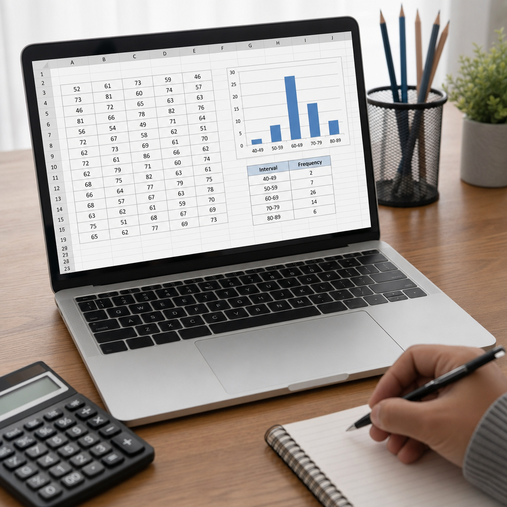
Frequency tables are one of the simplest and most useful tools in descriptive statistics because they turn a long list of raw values into a clear summary of how often each value, category, or interval appears. In data analysis, I use frequency tables at the start of almost every project, whether I am reviewing survey responses, checking production defects, profiling website events, or validating a new dataset before modeling. They reveal patterns quickly, expose data quality issues, and create a foundation for charts, percentages, cumulative distributions, and more advanced statistical interpretation.
To create a frequency table, you count observations and organize those counts into a structured display. The “frequency” is the number of times a value occurs. In descriptive statistics, that count can be shown as an absolute frequency, a relative frequency expressed as a proportion or percentage, or a cumulative frequency that adds counts progressively. For numerical data, a frequency table may list each distinct value if the range is small, or it may group values into class intervals such as 0–9, 10–19, and 20–29. For categorical data, it usually lists labels like product type, region, or response option.
This matters because raw data alone rarely supports decision-making. A manager reading 5,000 transaction amounts cannot instantly identify concentration, spread, outliers, or missing values, but a well-built frequency table makes those features visible. In education, teachers use frequency tables to summarize scores before discussing central tendency. In quality control, analysts inspect defect counts by type to prioritize corrective action. In healthcare, patient age groups and diagnosis categories are often tabulated before risk analysis. In digital analytics, event frequencies show which actions dominate a user journey. Across these cases, the table is not the final answer; it is the starting point for interpretation.
As a hub within descriptive statistics, this topic also connects directly to measures of center, variability, shape, and visual summaries. Once frequencies are organized, you can calculate the mode immediately, estimate medians from cumulative counts, prepare histograms and bar charts, compare distributions across groups, and detect skewness or unusual concentration. In practice, frequency tables sit alongside mean, median, quartiles, standard deviation, and cross-tabulation as core tools for describing data before any inferential step. If you understand how to build them correctly, you improve every later stage of analysis.
What a Frequency Table Includes
A complete frequency table contains more than a simple count column. At minimum, it lists the value or class and its frequency. In most professional work, I also include relative frequency and cumulative frequency because stakeholders often need both count and context. A value of 40 observations means little without knowing whether the sample contains 50 records or 50,000. Relative frequency solves that by dividing each count by the total number of observations. Cumulative frequency is especially important for ordered data because it shows how many observations fall at or below each level.
For example, suppose a dataset records daily customer complaints. If the values are 0, 1, 2, 3, and 4 complaints, a discrete frequency table can list each value separately. If the dataset records annual incomes from $18,000 to $140,000, listing every exact value is inefficient, so grouped intervals are better. For categorical variables such as browser type, complaint reason, or blood group, frequencies are counted by category. The choice depends on the measurement scale: nominal, ordinal, discrete numeric, or continuous numeric. Good descriptive statistics always respect that scale.
Another important component is handling missing or invalid data. In real datasets, blanks, nulls, impossible codes, and duplicate labels are common. I routinely add a separate row for missing values rather than excluding them silently. That decision preserves transparency and often reveals collection problems. A frequency table should answer direct questions clearly: What appears most often? How concentrated is the distribution? Are there gaps, extreme values, or suspicious categories? If the table does not make those answers easier to extract, it needs revision.
How to Create a Frequency Table Step by Step
The process begins with defining the variable and the purpose of the summary. Ask whether the variable is categorical, discrete, or continuous, and ask what the audience needs to learn from the table. Then clean the data. Standardize labels, remove accidental spaces, verify data types, and identify missing values. In Excel, I often start with filters and COUNTIF or PivotTable checks. In Python, pandas value_counts() is the quickest audit. In SQL, GROUP BY with COUNT(*) performs the same role. Tool choice matters less than disciplined preparation.
Next, sort the values logically. Categories can be alphabetical, by business importance, or by descending frequency. Ordered responses like “strongly disagree” to “strongly agree” must follow their true sequence rather than alphabetic order. For continuous data, choose class intervals. Class intervals should be mutually exclusive, collectively exhaustive, and easy to interpret. Analysts commonly use equal-width bins because they are readable and support histogram creation, but there are cases for unequal bins, such as age bands defined by policy categories. What matters is consistency and a reasoned explanation.
After defining values or intervals, count how many observations fall into each one. Then compute percentages and cumulative totals if useful. Finally, review the table for completeness. The frequencies should sum to the dataset total, percentages should sum to 100 percent apart from rounding, and interval boundaries should not overlap. I have seen avoidable reporting errors caused by bins like 10–20 and 20–30, where the value 20 could belong to either group. A safer convention is 10–19, 20–29, or labeled half-open intervals such as 10 to less than 20.
| Step | What to do | Why it matters | Example tool or method |
|---|---|---|---|
| 1. Define variable | Identify whether data is categorical, discrete, or continuous | Determines whether to list exact values or use intervals | Review data dictionary or schema |
| 2. Clean data | Standardize labels, check missing values, fix obvious errors | Prevents split categories and misleading counts | Excel filters, SQL CASE, pandas replace() |
| 3. Create categories or bins | Set category order or interval width and boundaries | Shapes interpretation of the distribution | PivotTable grouping, pandas cut() |
| 4. Count frequencies | Tally observations in each category or interval | Produces the core descriptive summary | COUNTIF, GROUP BY COUNT(*), value_counts() |
| 5. Add percentages | Divide each count by total observations | Makes categories comparable across datasets | Spreadsheet formulas or calculated fields |
| 6. Add cumulative totals | Progressively sum counts or percentages when order matters | Supports median, percentile, and threshold analysis | Running total formula |
| 7. Validate | Check totals, overlaps, and rounding | Ensures accuracy and trust in reporting | Reconciliation to source row count |
Choosing Between Ungrouped and Grouped Frequency Tables
An ungrouped frequency table lists each distinct observed value. It works best for small ranges or low-cardinality variables. If you are summarizing the number of children in a household, days absent from school, or ratings on a 1-to-5 scale, ungrouped tables preserve exact detail. They are also ideal when the mode matters strongly, as in inventory units ordered or defect counts per batch. The disadvantage is that they become unwieldy when distinct values are numerous.
A grouped frequency table combines values into intervals. This is the standard approach for continuous variables such as height, income, response time, or temperature. Grouping reduces noise and makes the shape of a distribution easier to inspect, but it introduces design choices. Wider bins simplify the summary while hiding variation. Narrower bins preserve detail while increasing clutter. In practice, I often test several bin widths before publishing a final table. Rules such as Sturges’ formula, the square-root rule, and the Freedman–Diaconis approach can inform the number of bins, though business interpretability should still guide the final choice.
For example, a customer support team measuring call durations may build intervals of 0–2 minutes, 2–5, 5–10, and 10+. Those bins are not equal width, but they reflect service-level thresholds better than purely mathematical bins. By contrast, exam scores are usually grouped into equal-width intervals like 50–59, 60–69, and 70–79 because the audience expects familiar grade bands. The right structure is the one that balances statistical clarity with practical meaning.
Frequency Tables for Categorical and Numerical Data
Categorical data and numerical data require different handling, even though both can be summarized with frequencies. For categorical data, every distinct label represents a category, and the goal is usually comparison. Examples include department, purchase channel, brand preference, and incident type. Here, consistency in labeling is critical. “North East,” “Northeast,” and “NE” should not appear as separate rows unless they are truly different categories. Once labels are standardized, a frequency table quickly shows dominance, rarity, and long-tail patterns.
For numerical data, the analyst must decide whether exact values or grouped intervals best support interpretation. Discrete counts, such as number of returns per customer, can often remain ungrouped. Continuous measures, such as wait time or weight, usually need intervals. Ordered numerical tables also support cumulative analysis, which lets you identify medians, quartiles, or service thresholds. If 82 percent of deliveries occur within three days, that conclusion comes directly from cumulative frequency or cumulative relative frequency.
One useful distinction is that categorical frequency tables pair naturally with bar charts, while grouped numerical tables pair naturally with histograms. The underlying table drives the visualization. If the table is flawed, the chart will be flawed as well. That is why I treat the frequency table as a quality-control checkpoint, not just a reporting artifact. It is often the first place where impossible values, hidden categories, or suspicious spikes become obvious.
Common Mistakes and How to Avoid Them
The most common mistake is using inconsistent categories or overlapping intervals. If one analyst labels age bins as 18–24 and 25–34 while another uses 18–25 and 26–35, comparisons become unreliable. Define bins once and document them. Another error is dropping missing values without disclosure. In operational datasets, missingness can be informative. If 12 percent of respondents skipped a question, that should appear in the descriptive summary, especially before interpreting percentages.
A third mistake is choosing bins that distort the story. With very wide intervals, a skewed distribution may appear balanced. With very narrow intervals, random noise may look meaningful. I have seen executive dashboards show revenue ranges that hid a concentration of low-value customers because the highest bin was too broad. The solution is to test the table against the analytic question. If the question concerns thresholds, design bins around thresholds. If the question concerns shape, choose bins that reveal shape without exaggeration.
Rounding errors and denominator errors also matter. Percentages should be based on the correct total after defining whether missing values are included or excluded. When percentages are rounded to one decimal place, they may sum to 99.9 or 100.1; that is acceptable if disclosed. More serious is reporting percentages from filtered data while presenting the full sample size elsewhere. A reliable frequency table is internally consistent, documented, and reproducible.
Using Frequency Tables Across Descriptive Statistics
Frequency tables are not isolated tools; they support the wider practice of descriptive statistics. The mode is the category or value with the highest frequency. The median can be located by finding where the cumulative frequency crosses the midpoint of the dataset. Percentiles and quartiles can be estimated from cumulative distributions, especially in grouped data. Shape is inferred from how frequencies cluster, spread, and trail off across intervals. A long right tail in income or transaction size often indicates positive skew, while a concentration around the center suggests lower dispersion.
They also help when comparing subgroups. A single overall frequency table may hide important differences between regions, age segments, or product lines. In practice, I often create separate frequency tables or cross-tabulations to reveal those differences. That is where this hub connects to related descriptive statistics topics: bar charts and histograms for visual comparison, contingency tables for two-variable relationships, measures of central tendency for typical values, and measures of dispersion for spread. If you are building a strong foundation in data analysis and interpretation, frequency tables are one of the first competencies to master because they connect raw records to nearly every downstream summary.
Software makes the mechanics faster, but not the reasoning. Excel PivotTables, Google Sheets pivot tables, SPSS Frequencies, R table() and cut(), Python pandas crosstab() and value_counts(), and SQL aggregation all generate counts efficiently. Still, the analyst must decide what to count, how to group it, how to handle missing data, and how to present the result honestly. That judgment is what separates basic tallying from sound descriptive statistics.
Creating frequency tables well is less about memorizing a formula and more about learning to summarize data in a way that is accurate, readable, and useful. Start by identifying the variable type, clean the data carefully, decide whether exact values or grouped intervals fit the task, and then calculate counts, percentages, and cumulative totals where they add value. Check totals, interval boundaries, and missing-data treatment before sharing the table. These simple controls prevent many of the errors that weaken analysis.
Within descriptive statistics, frequency tables act as a hub because they connect naturally to modes, medians, quartiles, histograms, bar charts, cross-tabulations, and distribution analysis. They help you answer practical questions fast: What occurs most often? How concentrated is the data? Where are the thresholds, gaps, and anomalies? Whether you work in business, research, education, healthcare, or operations, those questions appear constantly, and the frequency table is often the fastest trustworthy way to answer them.
If you want to improve your data analysis and interpretation skills, practice building frequency tables from real datasets using more than one tool. Compare ungrouped and grouped versions, test different interval designs, and always reconcile your totals. That habit will strengthen every descriptive statistics technique you use next.
Frequently Asked Questions
What is a frequency table, and why is it important in data analysis?
A frequency table is a structured summary that shows how often each value, category, or class interval appears in a dataset. Instead of scanning a long column of raw numbers or labels, you can use a frequency table to see the distribution of the data at a glance. For example, if you have survey answers, defect codes, purchase categories, or exam scores, a frequency table turns that raw information into a readable format that highlights counts, patterns, and concentrations.
In practice, frequency tables are important because they are often the fastest way to understand what a dataset contains before doing deeper analysis. They help identify common values, rare outcomes, missing categories, unusual spikes, and potential data quality problems such as inconsistent labels or impossible values. They also provide a foundation for creating charts, calculating percentages, and comparing groups. In descriptive statistics, a frequency table is one of the most practical first steps because it simplifies complexity without losing the essential shape of the data.
How do you create a frequency table step by step?
To create a frequency table, start by listing the raw data clearly in one place and deciding what type of variable you are working with. If the data are categorical, such as product type or survey response, list each distinct category. If the data are numerical and contain many different values, decide whether you want exact values or grouped intervals. Then count how many times each value or category appears. Those counts become the frequency column.
Once you have the basic counts, it is often useful to add more columns for relative frequency, percentage, and cumulative frequency. Relative frequency is the count divided by the total number of observations, and percentage is that value multiplied by 100. Cumulative frequency is especially useful for ordered numerical data because it shows the running total up to each value or interval. A clear final table usually includes the value or class, the frequency, and optionally the percentage and cumulative count. The key is consistency: categories should be defined carefully, intervals should not overlap, and all observations should fit into one and only one row of the table.
When should you use grouped frequency tables instead of listing every value?
You should use a grouped frequency table when numerical data contain too many distinct values to present efficiently one by one. For small datasets with repeated numbers, listing each value may work well. But for larger datasets, such as test scores, ages, transaction amounts, or measured times, an ungrouped table can become long and difficult to interpret. Grouping values into intervals, sometimes called classes or bins, makes the distribution much easier to read.
The goal of grouping is to summarize the data without hiding important structure. Good class intervals are mutually exclusive, collectively exhaustive, and logically spaced. For example, score ranges such as 0–9, 10–19, 20–29, and so on are easy to understand because they cover the full range without overlap. Grouped tables are especially helpful when you want to spot concentration, spread, skewness, or clustering. However, it is important not to make intervals so wide that meaningful detail disappears or so narrow that the table becomes cluttered again. In short, grouped frequency tables are best when clarity and pattern recognition matter more than preserving every exact raw value.
What are the most common mistakes to avoid when creating frequency tables?
One common mistake is using inconsistent or unclean categories. For example, labels such as “Yes,” “yes,” and “YES” may be counted separately unless the data are standardized first. Another frequent issue is forgetting to account for missing or invalid values, which can distort totals and percentages if they are ignored without explanation. In numerical data, poorly chosen class intervals can also cause problems, especially if ranges overlap or leave gaps. Every observation should fit into one category only, and the logic for class boundaries should be obvious.
Another mistake is stopping at raw counts without considering context. A frequency of 25 may sound large, but its meaning depends on whether the dataset has 30 observations or 3,000. That is why percentages and relative frequencies are often just as important as counts. It is also easy to make arithmetic errors when summing frequencies or calculating cumulative totals, so checking that all counts add up to the full dataset is essential. Finally, many people create frequency tables mechanically without using them analytically. A strong frequency table is not just a reporting tool; it should help you notice patterns, verify assumptions, and ask better follow-up questions about the data.
How can frequency tables help reveal patterns and data quality issues?
Frequency tables are excellent for surfacing both analytical insights and data problems because they condense raw observations into a visible distribution. When you look at the counts and percentages, you can quickly identify dominant categories, rare cases, gaps, and unusual concentrations. In survey data, this might show which responses are most common. In operational data, it could highlight the defect type occurring most often. In web analytics, it may reveal which events are driving user activity. This kind of summary helps you move from raw records to interpretable patterns almost immediately.
They are also one of the simplest tools for detecting data quality issues early. Unexpected categories, misspellings, duplicate label formats, out-of-range values, and suspiciously high or low counts become much easier to notice in a frequency table than in raw data. For example, if customer status values include “Active,” “active,” and “Actve,” the table exposes the inconsistency right away. If ages include a value of 250, or if a class interval contains far more records than expected, that can prompt validation checks. This is why frequency tables are often used at the beginning of data projects: they do not just summarize the data, they help confirm whether the data can be trusted.





