
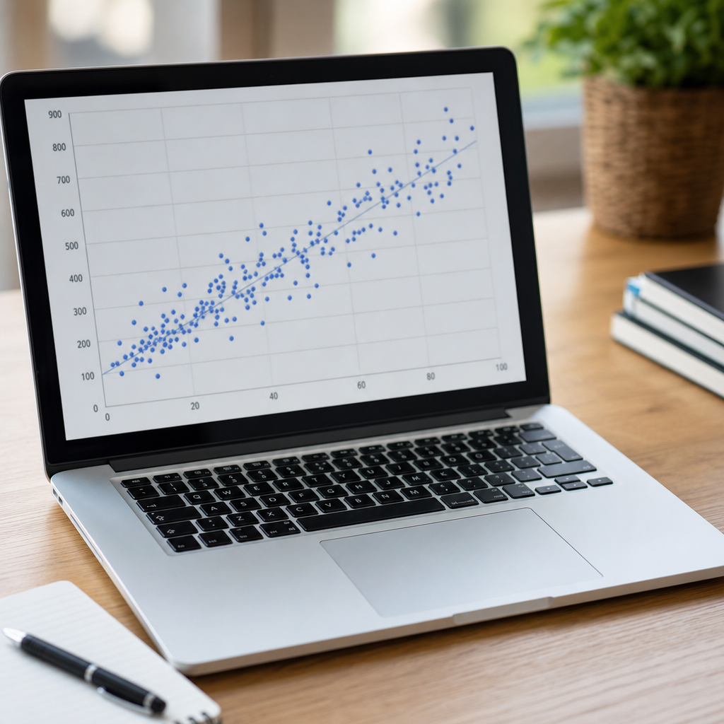
Scatter plots and relationships in data sit at the heart of practical data visualization because they show how two quantitative variables move together, where patterns break down, and when apparent trends are misleading. In data analysis, a scatter plot places one variable on the horizontal axis and another on the vertical axis, then represents each observation as a point. That simple design answers questions analysts ask every day: Are sales rising with ad spend, do taller students jump higher, does website traffic convert better on mobile, and where are the outliers distorting the story? I rely on scatter plots early in almost every project because they reveal structure before formal modeling begins. They matter not only for statisticians but for managers, marketers, scientists, and product teams making decisions from raw measurements. As the hub page for data visualization within data analysis and interpretation, this article explains what scatter plots show, how to read them correctly, when they fail, and how they connect to broader visual methods such as line charts, histograms, box plots, bar charts, heat maps, dashboards, and interactive reporting.
A strong grasp of scatter plots improves both exploration and communication. Exploration means using visuals to detect correlation, clusters, nonlinearity, heteroscedasticity, and data quality problems. Communication means choosing the right encodings so a stakeholder can understand a relationship in seconds instead of decoding a spreadsheet. Terms matter here. Correlation describes the direction and strength of association, not proof of cause. Regression estimates a fitted relationship, often as a line or curve. Outliers are observations unusually far from the overall pattern. Overplotting occurs when many points overlap and hide density. A good data visualization balances accuracy, readability, and context, usually with clear scales, labels, source notes, and restrained formatting. In my experience, teams often jump to dashboards before understanding the underlying relationships. Scatter plots slow that impulse in a productive way. They force a direct look at the data, and that discipline improves every downstream chart, model, and recommendation built on top of it.
What a scatter plot reveals about relationships in data
A scatter plot is the default chart for examining the relationship between two numeric variables because it preserves individual observations. Unlike a bar chart, which aggregates values into categories, a scatter plot keeps each row of the dataset visible. That makes it ideal for seeing whether a relationship is positive, negative, linear, curved, weak, strong, or nonexistent. For example, if customer acquisition cost is plotted against conversion rate by campaign, a downward slope may suggest more efficient campaigns convert better. If the points curve, a simple linear summary would miss the real behavior. If points split into separate clouds, the combined average may hide meaningful segments such as returning versus first-time users.
Scatter plots also reveal spread. Two datasets can share the same average trend but differ sharply in predictability. In one project, I reviewed manufacturing data where machine temperature and defect rate showed a similar upward direction across two plants. Plant A had a tight band of points, indicating a stable process. Plant B had the same slope but much wider variance, suggesting inconsistent calibration or measurement error. The chart changed the discussion from “temperature matters” to “process control differs by plant,” which is a much more actionable conclusion. This is why data visualization is not decoration; it is a diagnostic tool.
Another advantage is anomaly detection. A single outlier can indicate fraud, sensor failure, a special event, or a data entry issue. In retail analytics, plotting transaction amount against item count often surfaces returns, bulk purchases, or malformed records immediately. A point with one item and a negative total deserves investigation. A point with 5,000 items and a tiny revenue figure may be a system bug. Seeing those cases on a scatter plot is faster than discovering them after a model has already been trained on flawed data.
How to interpret direction, strength, form, and uncertainty
Reading a scatter plot well requires four habits: identify direction, judge strength, inspect form, and question uncertainty. Direction asks whether higher values of one variable generally align with higher or lower values of the other. Strength concerns how tightly points cluster around an implied pattern. Form asks whether the pattern is linear, exponential, logarithmic, cyclical, or segmented. Uncertainty reminds you that visible patterns may depend on sample size, missing data, or hidden variables. Analysts who skip the fourth step often overstate what a chart proves.
Correlation coefficients such as Pearson’s r can complement the chart, but they do not replace it. Pearson correlation captures linear association and is sensitive to outliers. Spearman rank correlation is better when the relationship is monotonic but not linear. Anscombe’s quartet remains the classic warning: four datasets can share nearly identical summary statistics while looking very different when plotted. One may be linear, another curved, another dominated by an outlier, and another shaped by a vertical cluster. The lesson is durable: visualize first, summarize second.
Uncertainty also comes from the data generating process. A high relationship between ice cream sales and drowning incidents does not mean one causes the other; both rise with warmer weather. In business settings, ad spend and revenue may move together because both increase during promotions, holidays, or product launches. A scatter plot helps you frame the right question, but causal claims require design choices such as experiments, controls, time-based analysis, or quasi-experimental methods. Good interpretation is careful interpretation.
Design choices that make scatter plots clearer and more honest
The most effective scatter plots are visually quiet and semantically precise. Start with axis labels that name the measure and unit, such as “Monthly ad spend (USD)” or “PM2.5 concentration (µg/m³).” Keep axis ranges appropriate to the data and avoid unnecessary truncation that exaggerates movement. Use point size sparingly; oversized markers create overlap and make dense areas unreadable. Transparency, often called alpha, is one of the best fixes for overplotting because it allows darker regions to signal concentration. Jitter can help when values are rounded or repeated, especially in survey scales.
Color should encode meaning, not decorate the page. A third variable can be shown through hue, but only when categories are limited and distinct. For continuous third variables, a color gradient may work, though it raises cognitive load and should be accompanied by a legend. Shape can distinguish small sets of groups, but too many symbols become noise. Trend lines are useful when they clarify, not when they imply certainty unsupported by the data. A linear fit, LOESS smoother, or confidence band should reflect the intended message and the amount of data available.
Tools matter because defaults shape decisions. In Excel, many teams can create a basic scatter plot quickly, but default styling often needs cleanup. Tableau and Power BI make filtering and color encoding easier for business reporting. Python libraries such as Matplotlib, Seaborn, and Plotly support granular control, while R users often rely on ggplot2 for layered, statistically informed graphics. Regardless of tool, the principles are consistent: clear scales, readable annotations, minimal chartjunk, and explicit context.
Common pitfalls: overplotting, misleading scales, and false conclusions
The biggest technical problem in scatter plots is overplotting. When thousands of observations stack on the same coordinates, the chart underreports density and can suggest gaps that are not real. Remedies include transparency, smaller markers, hexbin plots, density contours, sampling, or faceting by subgroup. If the audience needs exact relationship detail at scale, a heat map or bivariate density plot may outperform a raw scatter. The right visual depends on volume, not just convention.
Misleading scales are another frequent issue. Unequal intervals, compressed ranges, or unlabeled log scales can distort how viewers judge relationships. Log scales are valid and often necessary for revenue, population, or biological measures that span orders of magnitude, but they must be clearly labeled because equal visual distance represents multiplicative change, not additive change. Missingness creates subtler distortions. If high values are absent because sensors fail beyond a threshold, the visible relationship may appear flatter than reality.
False conclusions usually stem from confounding, subgroup mixing, or selective attention. Simpson’s paradox is a useful warning: a relationship observed in aggregate can reverse within groups. Hospital outcomes, school performance, and marketing channels all produce examples where segmentation changes the interpretation. I have seen campaign data where total spend appeared unrelated to conversions, yet channel-level plots showed strong positive relationships within search and email separately. The aggregate cloud hid the signal because the channels operated at different scales and efficiencies.
| Challenge | What it looks like | Best fix | Example |
|---|---|---|---|
| Overplotting | Too many overlapping points | Transparency, smaller marks, hexbin | User events by minute |
| Outliers | Few points far from main cloud | Annotate, verify, analyze separately | Fraudulent transactions |
| Nonlinearity | Curved pattern | Add smoother or transform scale | Price versus demand |
| Hidden groups | Mixed clouds obscure trends | Color or facet by segment | Mobile versus desktop conversions |
| Misleading scale | Pattern exaggerated or flattened | Use consistent, labeled axes | Compressed profit range |
Scatter plots within the broader data visualization toolkit
As a hub for data visualization, this page should place scatter plots in context. No single chart answers every analytical question. Histograms show the distribution of one numeric variable and help assess skew, modality, and spread. Box plots summarize distribution and outliers across groups. Line charts track change over time and are better than scatter plots when temporal continuity is the main message. Bar charts compare categories, though they should not be forced onto continuous data. Heat maps reveal intensity across matrices, calendars, or correlation tables. Maps are appropriate when geography matters, but location should not be used as decoration for nonspatial data.
Interactive dashboards combine several of these views. A practical workflow often starts with a histogram to understand each variable, moves to scatter plots to examine pairwise relationships, then uses box plots or segmented bars to compare groups. Correlation matrices can direct attention to likely relationships, but the matrix should lead back to individual scatter plots because pairwise coefficients alone miss shape and anomalies. In machine learning and exploratory data analysis, pair plots extend this idea across multiple variables, creating a grid of scatter plots and distributions. They are useful for small to medium feature sets, though they become cluttered quickly.
The strongest visualization programs create consistency across the entire toolkit. That means shared color conventions, standardized number formatting, accessible contrast, and chart selection tied to the question being asked. If the question is “How are these two metrics related?” choose a scatter plot. If it is “How is one metric distributed?” choose a histogram or density plot. If it is “How does a metric change over time?” choose a line chart. Matching chart to question is the first rule of trustworthy analysis.
Real-world applications across business, science, and public policy
Scatter plots are widely used because relationships drive decisions. In sales analytics, plotting lead response time against close rate often shows a sharp decline after the first few hours, which supports staffing changes or automated routing. In healthcare, body mass index plotted against blood pressure can show an overall association while also revealing age-based clustering that demands separate interpretation. In environmental science, carbon dioxide concentration against temperature anomaly may indicate long-term association, but scientists still layer time, lags, and physical mechanisms before drawing conclusions.
Public policy teams use scatter plots to compare spending and outcomes across jurisdictions. For example, education analysts may plot per-student expenditure against graduation rates, then encode district poverty level by color. The chart quickly shows that money alone does not explain performance, while also revealing districts that outperform peers under similar constraints. Those outliers become candidates for qualitative review. In digital products, product managers compare session length with retention, feature usage with conversion, or page load speed with bounce rate. Often the first insight is not the average trend but the threshold where behavior changes.
The practical benefit is actionability. A well-built scatter plot can tell you whether to segment, whether to transform a variable, whether to investigate anomalies, and whether a predictive model has a chance of capturing signal. It can also prevent expensive mistakes by showing that a presumed relationship is weak or unstable. That is why scatter plots remain foundational in modern data visualization, from boardroom dashboards to Jupyter notebooks.
Best practices for building a reliable visualization workflow
Reliable data visualization starts before the chart. Validate units, check duplicates, inspect missing values, and confirm that axes reflect meaningful measures. Build the simplest scatter plot first, then add segmentation, trend lines, annotations, or interactivity only if they sharpen interpretation. Document data sources and transformation steps so others can reproduce the view. When presenting, pair the chart with one precise takeaway, such as “Conversion improves as response time falls, with the steepest gains inside two hours.” That kind of statement respects the data and guides decisions.
Review charts on different screens, test accessibility, and ask whether a nonexpert can explain the pattern back to you. Good visualization is judged by clarity and correctness, not ornament. If you manage a library of analytics content, connect this hub to deeper guides on histograms, box plots, correlation, regression diagnostics, dashboards, and storytelling with data. Scatter plots are the entry point, but the larger goal is disciplined interpretation. Use them early, use them carefully, and let them shape smarter questions. Explore the rest of your data visualization stack with the same rigor, and your analysis will become more accurate, more persuasive, and more useful.
Frequently Asked Questions
What does a scatter plot show, and why is it so useful in data analysis?
A scatter plot shows the relationship between two quantitative variables by placing one variable on the horizontal axis and the other on the vertical axis, then plotting each observation as a single point. Its strength lies in how quickly it reveals whether two measurements tend to move together, move in opposite directions, or show no clear relationship at all. For example, if ad spend increases and sales also tend to increase, the points may form an upward pattern. If one variable rises while the other falls, the pattern may slope downward. If the points are widely scattered without structure, there may be little or no meaningful association.
What makes scatter plots especially valuable is that they do more than suggest correlation. They also expose outliers, clusters, gaps, and changes in pattern that summary statistics can hide. Two datasets might share a similar average or even a similar correlation coefficient, yet look completely different when graphed. A scatter plot helps analysts avoid false confidence by showing the actual shape of the data. In practical work, that means better judgment when evaluating customer behavior, test scores, engineering measurements, scientific experiments, or any situation where understanding how two numeric variables relate is essential.
How can you tell whether a relationship in a scatter plot is positive, negative, or nonexistent?
To interpret the direction of a relationship, start by scanning the general movement of the cloud of points from left to right. If the points tend to rise as you move across the graph, the relationship is positive, meaning larger values of one variable are generally associated with larger values of the other. If the points tend to fall, the relationship is negative, meaning higher values of one variable are linked to lower values of the other. If there is no obvious upward or downward pattern, then the relationship may be weak or nonexistent.
It is also important to think about strength, not just direction. A strong relationship appears when points cluster closely around an imagined line or curve. A weak relationship appears when the points are much more spread out. Analysts should be careful not to force a conclusion from a small sample or from data with heavy scatter. In real-world datasets, relationships are often messy. A plot may suggest a generally positive trend, but with substantial variability. That still matters, because it tells you the variables may be related, though not in a precise or highly predictable way. Reading scatter plots well means judging direction, strength, and the overall visual consistency of the pattern together.
Can a scatter plot reveal more than just a straight-line relationship?
Yes, and this is one of the main reasons scatter plots are so important. Many real relationships are not linear. A scatter plot can reveal curves, turning points, plateaus, thresholds, and other patterns that would be easy to miss if you relied only on a linear model or a single correlation measure. For instance, study time and exam performance may rise together at first, then level off after a certain point. Likewise, exercise intensity and performance may improve up to an optimal range and then decline. These patterns are meaningful, and a scatter plot makes them visible.
Scatter plots can also uncover subgroups within the data. You might notice that one cluster of points behaves differently from another, suggesting separate populations, hidden categories, or contextual effects. In business data, one customer segment may respond strongly to promotions while another barely changes. In education, younger and older students may show different performance trends. Seeing these structures helps analysts ask better follow-up questions and choose better models. In short, scatter plots are not just tools for spotting straight lines; they are essential for detecting the true shape and complexity of relationships in data.
What are outliers in a scatter plot, and why do they matter so much?
Outliers are points that sit far away from the main pattern of the data. They matter because they can signal important exceptions, measurement errors, rare events, or meaningful special cases. In a scatter plot, an outlier might be a school with unusually high test scores despite low funding, a marketing campaign with unexpectedly strong sales, or a patient whose response differs sharply from the rest of the sample. These points should never be ignored automatically. Sometimes they reveal the most interesting part of the story.
Outliers also matter because they can distort interpretation. A single unusual point can make a relationship appear stronger, weaker, or even reversed compared with the pattern formed by most observations. That is why analysts use scatter plots before drawing conclusions from regression results or correlation values. By visually inspecting the data, they can ask whether an outlier reflects bad data, a one-time event, or a real but uncommon phenomenon. The right response depends on context. You may correct an input error, analyze the outlier separately, or keep it and discuss its influence openly. A scatter plot makes these decisions more informed because it puts anomalies in clear visual context.
Why can scatter plots sometimes be misleading, and how can you interpret them more accurately?
Scatter plots are powerful, but they can be misleading when viewers jump too quickly from association to causation. Just because two variables move together does not mean one causes the other. A positive pattern between ice cream sales and sunburn cases, for example, does not mean ice cream causes sunburn. A third factor, such as hot weather, may influence both. Scatter plots also become harder to interpret when axes are scaled poorly, when too many points overlap, or when important grouping variables are ignored. In those situations, patterns may appear stronger or weaker than they really are.
To interpret scatter plots more accurately, look at the full picture. Check the axis labels and scales, note whether the pattern is linear or curved, and look for clusters, gaps, and outliers. Consider the sample size as well, since a handful of points can suggest trends that do not hold up in larger datasets. If the plot is crowded, techniques such as transparency, jittering, or grouping by color can make the structure easier to see. Most importantly, pair the visual with subject-matter knowledge. Ask what mechanisms could explain the relationship, whether other variables might be involved, and whether the observed pattern is consistent with the real-world process being studied. That combination of visual evidence and contextual reasoning leads to much more reliable conclusions.





