
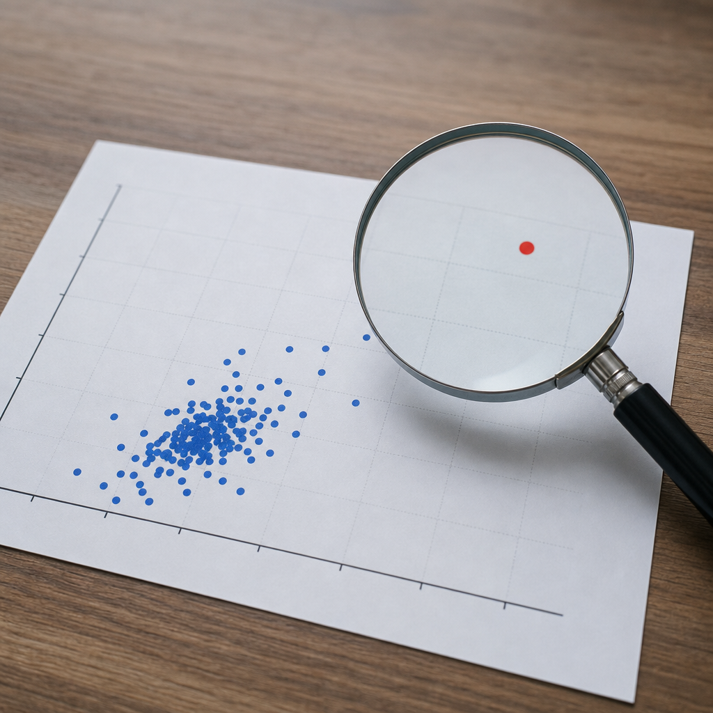
Outliers in data are observations that sit unusually far from the rest of a dataset, and identifying them correctly is one of the most important tasks in descriptive statistics. In practical analysis, an outlier may signal a measurement error, a rare but meaningful event, a data entry mistake, a process shift, or a naturally extreme value. I have seen all five cases in real projects, from a missing decimal point in sales records to a genuine equipment failure that predicted downtime. Because outliers can change averages, widen variability, distort charts, and mislead decisions, they belong at the center of any serious discussion of descriptive statistics, not at the margins.
Descriptive statistics is the branch of data analysis that summarizes a dataset so people can understand its typical values, spread, shape, and unusual observations. Core measures include central tendency, such as mean, median, and mode; dispersion, such as range, variance, standard deviation, and interquartile range; and distribution shape, including skewness and kurtosis. Outliers connect to all of these. A single extreme value can pull the mean upward, leave the median mostly stable, inflate the standard deviation, increase the range dramatically, and create the appearance of skewness. That is why a descriptive statistics hub must treat outliers as both a standalone topic and a bridge to the wider toolkit.
This matters well beyond academic exercises. In finance, an outlier may be a fraudulent transaction. In healthcare, it may reveal a dangerous lab result or a flawed sensor. In manufacturing, it may identify a machine drifting out of calibration. In customer analytics, one unusually large purchase can change segmentation thresholds if analysts rely only on averages. When teams skip careful outlier analysis, they often make bad forecasts, set weak controls, or remove valuable signals without realizing it. A disciplined approach improves data quality, strengthens interpretation, and creates a cleaner path to later methods such as correlation, regression, time series analysis, and anomaly detection.
As a hub within Data Analysis and Interpretation, this article connects descriptive statistics concepts into one workflow: understand the distribution, identify unusual values, test whether they are errors or valid extremes, measure their effect on summary statistics, and decide how to report or treat them. If readers understand that sequence, they can move confidently into deeper articles on box plots, z scores, skewed distributions, robust statistics, and exploratory data analysis. Outlier work is not about deleting inconvenient numbers. It is about preserving truth while preventing distortion.
What Counts as an Outlier in Descriptive Statistics
An outlier is not simply “a big number” or “a small number.” It is an observation that is unexpectedly distant relative to the pattern of the rest of the data. Context matters. A daily temperature of 95 degrees Fahrenheit may be normal in Phoenix in July and extraordinary in London in March. In descriptive statistics, analysts judge unusualness by comparing each value with a dataset’s center and spread. That is why outlier detection starts with summary measures and graphics rather than intuition alone.
The most common descriptive view separates data into three broad possibilities. First, the value is erroneous, caused by data entry, coding, sensor malfunction, duplication, unit mismatch, or sampling mistakes. Second, the value is valid but rare, such as a once-a-year revenue spike during a product launch. Third, the value indicates a different underlying process, like a hospital wait time that comes from holiday staffing rather than normal operations. These distinctions matter because each one leads to a different treatment choice.
Outliers also come in several forms. A univariate outlier is extreme on one variable, such as salary. A multivariate outlier may look ordinary on each variable individually but unusual in combination, such as a customer with moderate income and extremely high luxury spending. A point anomaly affects one record, while a contextual anomaly depends on time, place, or segment. In seasonal retail data, high December sales are not outliers when analyzed within the holiday context. Descriptive statistics provides the first pass for all of these cases by showing what is typical before asking what is exceptional.
How Outliers Affect Mean, Median, Spread, and Shape
The impact of outliers is easiest to see through standard descriptive statistics. The mean is sensitive because it uses every value directly. If nine stores each sell 100 units and one store sells 1,000, the mean jumps from 100 to 190, which overstates typical performance. The median, the middle value after sorting, remains 100 and better reflects the common outcome. That simple comparison explains why analysts often report both mean and median when distributions may contain extremes.
Measures of spread react strongly too. The range, defined as maximum minus minimum, can become almost meaningless when one extreme value dominates. Standard deviation and variance also rise because they square deviations from the mean, giving distant points more influence. The interquartile range, or IQR, is usually more stable because it focuses on the middle 50 percent of observations. When I review new datasets, I often compare standard deviation with IQR immediately; a large gap between them can signal heavy tails or notable outliers.
Distribution shape is another area where outliers matter. A high extreme value can create right skew, while a low extreme value can create left skew. In histograms and density plots, isolated bars at the tail often change how readers interpret the entire distribution. Kurtosis, often described as tail heaviness or peakedness, can also rise with extreme observations. This affects assumptions behind later statistical methods. A dataset that looks roughly normal before an outlier enters may no longer behave that way afterward, which changes how analysts summarize and model it.
The practical lesson is direct: if you report descriptive statistics without checking outliers, you may describe the exception rather than the rule. Executive dashboards, quality control reports, and baseline performance summaries are especially vulnerable because decision-makers often read only the headline numbers. Descriptive statistics should therefore include resistant measures, distribution visuals, and a note on whether extreme values were observed and how they influenced interpretation.
Common Methods for Identifying Outliers
Several standard methods help identify outliers, and each works best under different conditions. The z score method measures how many standard deviations a value lies from the mean. In roughly normal data, observations beyond 3 or below -3 are often flagged. This method is simple and widely taught, but it can fail when the distribution is skewed or when existing outliers distort the mean and standard deviation themselves. For that reason, z scores are useful but not sufficient on their own.
The IQR rule is often stronger for descriptive statistics because it relies on quartiles, which are less sensitive to extremes. Analysts compute the first quartile, third quartile, and IQR, then flag values below Q1 minus 1.5 times IQR or above Q3 plus 1.5 times IQR. This is the standard logic behind box plots. In business data, where revenue, transaction size, and time-to-completion are often skewed, the IQR method usually produces more credible first-pass results than a raw z score threshold.
Visual tools remain essential because no formula captures the whole story. Histograms reveal tail behavior, box plots show potential outliers clearly, scatterplots uncover unusual relationships, and time series plots expose spikes, drops, and regime shifts. I have repeatedly found that a chart catches what a threshold misses: a cluster of late-night transactions, a seasonal pulse, or a batch of duplicate readings after a device reset. Descriptive statistics is not just arithmetic; it is pattern recognition grounded in summary measures.
| Method | Best Use | Strength | Limitation |
|---|---|---|---|
| Z score | Roughly normal distributions | Fast and familiar | Sensitive to skew and existing extremes |
| IQR rule | Skewed business and operational data | Robust to extreme values | May flag valid tail observations in large samples |
| Box plot | Quick exploratory review | Easy visual communication | Less precise for multivariate patterns |
| Scatterplot | Two-variable relationships | Reveals interaction-based outliers | Limited when many variables exist |
| Time series plot | Sequential or seasonal data | Shows context and shifts | Needs enough time points for pattern detection |
For multivariate data, analysts may use Mahalanobis distance, isolation-based methods, or clustering diagnostics, but those belong more to advanced analysis than core descriptive statistics. Still, a hub article should note that univariate checks are not enough in many modern datasets. A loan application may have individually normal fields yet be unusual in combination. The right habit is to begin with descriptive methods, document findings, and escalate to multivariate tools when the business question or data complexity requires it.
Interpreting Outliers: Error, Rare Event, or Critical Signal
Finding an outlier is only the beginning. The key question is what it means. In practice, I use a simple sequence. First, verify the record. Check units, source systems, timestamps, transformations, and joins. Many extreme values are created during data preparation, not at data collection. A revenue field stored in cents instead of dollars can make normal transactions look absurdly large. A date parsing error can push valid records into impossible years. These are not analytical insights; they are data quality issues that need correction.
Second, compare the value with operational reality. If a factory temperature reading spikes, ask whether maintenance logs show an event at the same time. If customer churn surges in one week, check whether pricing changed or service failed. Good outlier interpretation combines descriptive statistics with domain knowledge. In regulated fields, documentation is part of the job. Healthcare analysts, for example, should trace unusual clinical values against lab standards, instrument calibration, and patient context before drawing conclusions.
Third, assess influence. Not every outlier deserves equal attention. Some are visually extreme but have little effect on summary measures or business decisions. Others completely alter conclusions. In one pricing analysis, a handful of enterprise contracts doubled the mean deal size, which made small-business performance look weak by comparison. Once we segmented the data and reported medians, the pattern became clear. The outliers were valid, but they belonged to a distinct customer type. Interpretation improved when descriptive statistics aligned with the underlying market structure.
This is why analysts should avoid automatic deletion rules. Removing valid extremes can erase the very events a business most needs to understand: fraud cases, catastrophic defects, major donor gifts, or emergency room surges. Equally, preserving obvious errors can corrupt every downstream metric. The standard is defensible reasoning. Each outlier decision should be explainable, repeatable, and tied to both statistical evidence and business context.
Best Practices for Handling and Reporting Outliers
There is no single correct way to handle outliers, but there are reliable best practices. Start by preserving the raw data. Never overwrite original values during cleaning. Create documented flags for suspected outliers and keep an audit trail of changes. Next, report both sensitive and resistant descriptive statistics when extremes are present. Mean and standard deviation show total influence; median and IQR show the typical pattern. Together they give readers a more complete picture than either set alone.
When treatment is necessary, choose the method that matches the problem. Correct obvious data entry mistakes when verification is possible. Exclude records only when there is a documented reason, such as impossible values or irrelevant populations. Winsorizing, which caps extreme values at selected percentiles, can reduce distortion in some reporting workflows, though it should be disclosed because it changes the distribution. Log transformation may help highly right-skewed variables such as income or transaction size, but transformed results must still be explained in plain language.
Segmentation is often the cleanest solution. If extreme values come from a different group, analyze that group separately. Retail analysts routinely separate wholesale accounts from consumer purchases because combining them produces misleading averages. The same logic applies to emergency cases versus routine visits in healthcare, premium subscribers versus free users in software, and scheduled versus unscheduled downtime in operations. Many so-called outliers are really signs that the dataset contains multiple populations.
Finally, communicate findings clearly. State how outliers were identified, how many records were affected, what action was taken, and how conclusions changed with and without those values. This is especially important in a descriptive statistics hub because these summaries often feed dashboards, executive reports, and internal links to deeper analyses. Transparent reporting builds trust and makes later interpretation stronger.
Outliers and the Broader Descriptive Statistics Toolkit
Outliers in data are best understood as part of the full descriptive statistics workflow, not as an isolated cleanup step. Analysts should move from frequency tables and summary measures to visual inspection, from center and spread to distribution shape, and from unusual values to segmentation and context. That sequence produces better interpretation because it answers the essential questions in order: What is typical, how variable is it, what shape does the data take, and which observations deserve special attention?
The main benefit of this approach is better judgment. You avoid letting a few extreme numbers redefine the whole dataset, but you also avoid hiding important rare events. Mean, median, range, standard deviation, variance, quartiles, and box plots all become more useful when read together. Outliers then shift from being a nuisance to being a source of insight about quality, risk, process change, and customer behavior. That is the real value of descriptive statistics in business and research settings.
If you are building stronger skills in Data Analysis and Interpretation, use this hub as your starting point. Review your next dataset with both numerical summaries and visuals, flag unusual values, verify their source, and document their effect on conclusions. That one habit will improve every descriptive statistics task that follows.
Frequently Asked Questions
What is an outlier in data, and why does it matter?
An outlier is a data point that lies unusually far from the rest of the observations in a dataset. In simple terms, it is a value that looks different enough to deserve closer attention. That difference matters because outliers can strongly influence summaries, charts, and statistical conclusions. A single extreme value can pull the average up or down, widen the spread of the data, distort correlations, and affect the fit of regression models. In business, science, operations, and finance, that can lead to poor decisions if the value is misunderstood or ignored.
Just as important, not all outliers mean the same thing. An unusual value might come from a measurement error, a typo, a faulty sensor, a change in process, a rare event, or a genuinely extreme but valid observation. Those possibilities have very different implications. A missing decimal point in a sales record should usually be corrected or removed, while an extreme reading tied to an equipment failure could be the most important signal in the dataset. That is why outlier analysis is not just a technical step in descriptive statistics. It is a diagnostic process that helps analysts separate bad data from meaningful exceptions.
How can you identify outliers in a dataset?
There is no single best method for identifying outliers, because the right approach depends on the size of the dataset, the shape of the distribution, and the purpose of the analysis. A common starting point is visual inspection. Box plots, histograms, scatter plots, and time series graphs often reveal unusual points quickly. Visual methods are especially useful because they also provide context, such as clustering, skewness, seasonality, or sudden jumps that a simple numerical rule might miss.
From a statistical standpoint, several standard techniques are widely used. The interquartile range, or IQR, method flags values below Q1 minus 1.5 times the IQR or above Q3 plus 1.5 times the IQR. This method is practical and robust for many descriptive analyses. Z-scores are another option, measuring how many standard deviations a value sits from the mean. They are easy to compute, but they work best when the data is roughly symmetric and not heavily skewed. For more complex situations, analysts may use modified z-scores, robust distance measures, clustering methods, or model-based approaches that account for multivariate structure.
Good identification also depends on domain knowledge. A number that looks extreme statistically may be completely normal operationally, while a value that appears ordinary in isolation may be suspicious when compared with known limits, process rules, or historical patterns. The most reliable workflow usually combines statistical rules, visual checks, and subject-matter understanding rather than relying on a single automated threshold.
Are outliers always errors, or can they be useful?
Outliers are not always errors, and in many real-world analyses they are exactly the observations you most need to understand. Some outliers do result from mistakes, such as data entry problems, missing decimal points, duplicate records, broken instruments, or unit mismatches. Those cases can damage analysis quality and should typically be corrected, excluded, or traced back to the source system. However, other outliers represent real and important events. They may reveal equipment failures, sudden demand spikes, fraud, customer churn signals, adverse clinical responses, or market shocks.
This is why treating every extreme value as “bad data” is risky. A true outlier can be the first sign of process drift or a rare but meaningful occurrence that standard summary statistics would otherwise hide. In predictive work, these unusual cases may help define the very risks or opportunities a model is meant to detect. The real task is interpretation. Analysts should ask what mechanism could have produced the observation, whether it is internally consistent, whether it matches external evidence, and whether keeping or removing it changes the conclusion in an important way. Useful outlier analysis is less about automatic deletion and more about careful investigation.
What impact do outliers have on statistical analysis and decision-making?
Outliers can have a major effect on both descriptive statistics and downstream decisions. In summary measures, they can inflate the mean, increase the standard deviation, and exaggerate the range. They can make a dataset appear more variable than it really is for most observations. In correlation and regression, even one or two extreme points can change the slope of a fitted line, alter the strength of relationships, and create misleading impressions about trends. In classification and forecasting, unusual observations can also influence model training, threshold setting, and performance estimates.
The business impact can be equally significant. If outliers are ignored when they reflect real problems, an organization may miss warning signs of equipment breakdown, fraud, quality defects, or unusual customer behavior. If outliers are removed carelessly when they are valid, analysts may sanitize away the very extremes that matter most in risk analysis and operational planning. On the other hand, if obvious errors are left in place, dashboards, benchmarks, and forecasts can become unreliable. That is why decision-makers should never look at outlier handling as a routine cleanup step alone. It is part of ensuring that the analysis reflects reality and supports sound action.
What should you do after finding an outlier?
After identifying an outlier, the next step is to investigate it rather than immediately delete it. Start by validating the record. Check the original source, units, timestamps, calculation logic, and collection method. Confirm whether the value could have resulted from a typo, sensor malfunction, missing decimal point, coding issue, or system integration problem. If the point is linked to an obvious error and a correct value can be recovered, fix it. If it is clearly invalid and cannot be repaired, document the reason for exclusion and remove it in a controlled, transparent way.
If the outlier appears to be valid, the question becomes how to handle it analytically. In some cases, you should keep it because it reflects a meaningful rare event. In others, it may be useful to run the analysis both with and without the outlier to measure sensitivity. You might also choose more robust statistics, such as the median and IQR, or use transformations and modeling approaches that reduce the influence of extreme values. Most importantly, document the decision process. A strong analysis explains what was found, why the point was classified the way it was, and how that choice affected results. That level of transparency makes the findings more credible and much easier to defend.





